
They've been called the "stairs of death"
- Details
- Last Updated: Thursday, 24 March 2016 00:19
- Written by Dr. Donald H. Mershon
Summary: Teaching a course in human perception can be even more fun, when it's possible to use local examples to illustrate one's presentation. The current topic discusses two independent sets of stairs in a university's libraries. Each case demonstrates the potential dangers of ignoring fundamental aspects of perception (such as the Gestalt Laws of Organization) and/or the science of human factors.
The article Gestalt Psychology – Laws of organization summarized some of the factors that can strongly influence the ways we perceive. Specifically, when we are presented with a visual pattern, we tend to see the display as being composed of objects that follow certain general rules. For example, if the pattern allows for perceiving alternative forms, we tend to see objects that are symmetrical, are composed of continuous lines, and are simple. When the display consists of many separate parts, we tend to organize these parts into groups, based upon similarity and proximity, as well as any direct links (however small) among the parts and by any structures that enclose some objects separately from others.
Although I pointed out that the above principles operated probabilistically, not as absolute dictums, ignoring the highly likely outcome of the Laws can have significant consequences in the real world.
Note: The rest of this article is true, including the locations involved. There is no reason to attempt to change the place names; for anyone interested, other personal information already on this Site would be sufficient to "connect the dots."
The first situation
During my tenure at North Carolina State University, the university was provided funding to build two or three significant expansions for its main library. Part of one such expansion completely rebuilt the primary entry. Rather than climbing outside stairs, to enter on what was the second floor, library patrons would enter through lower-level doors, pass through turnstiles and then use stairs or elevators to reach the main lobby. Those leaving the library would descend by stairs/elevators and then pass through a security checkpoint to exit the building.
My analysis of the resulting changes suggests that a critical factor involved the location of the new stairs. If one wished to exit the building after checking out library materials in the upper lobby, the stairs were immediately available; the elevators required one to walk down a hall and around a corner.
The original design of the new stairway included a surface of beige-colored tiles, oriented with their longer dimension perpendicular to the edge of the stairs' tread. If one approached the stairs from the upper-floor lobby, it was possible to be confronted with the situation shown in Figure 1. To varying degrees, the tile pattern made it difficult to distinguish the edges of the treads. In particular, the grout that separated the tiles could be readily perceived as continuous lines and there was little to emphasize the individual steps that one had to navigate, in order to safely descend the stairs. Even the intermediate landing and the floor below were constructed of the same tile, creating further confusion.
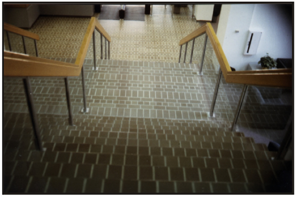
Figure 1
Original appearance of the new stairs
in the D. H. Hill Library (from above).
Photo by author.
To some extent, ascending the stairs was also an issue. The individual steps were constructed with open-risers. That is, one saw not only the tread surfaces on which one wished to put one's foot, but also saw through the steps – and thus had to visually separate whatever had been stored behind/under the stairway. Of course, as from above, the grout lines on the stair surfaces themselves continued to "urge" a percept that camouflaged the edges of the treads.
In addition to the perceptual issues that did little for safe movement either up or down the stairway, there was also a basic human factors concern. The only handgrips along the sides of the stairs were made from a thick section of wood, positioned well above waist height. Although attractive, these rather high grips were difficult to grip well unless one was fairly tall, had a large hand and good grip strength.
Thus, as in so many situations that lead to accidents, many factors combined to set the stage. Perceptual factors that hid the edges of the steps (and/or distractions through the open risers, if one were ascending) could lead to awkward hesitations, to missteps and/or falls. Sadly, even if a walker recognized that he/she was in trouble, it was often difficult to fully compensate in time, given the design of the handrails.
While these stairs were in use, there were several reports of falls, including at least one broken arm and at least one concussion. Something had to be done.
An attempt to solve the problem
The first attempt to improve the dangerous stairs took a rather minimalist approach. No major modifications were done. Instead, rows of dots (of the sort ordinarily used to reduce slips in a bathtub/shower) were positioned along the front of each tread, apparently with the intent of better demarcating the front edges.
Unfortunately, as shown Figure 2, the dots may have actually increased the fundamental problem. In addition to the effect of the unchanged, continuous grout lines, there was now a full field of dots that concealed the critical edge information even more effectively!
During (or shortly after) the addition of the dots, staff members responsible for the university's physical plant – and for overseeing the new construction at the library – apparently discovered my area of expertise and contacted me. Unfortunately, my input occurred after their initial "solution" (see my letter of 1992). I can thus assure the reader that the dot treatment was certainly not a suggestion of mine. Although I did emphasize the perceptual problems of the disappearing tread edges, I pointed out that the excess visual clutter created by the dots was not helping the situation.
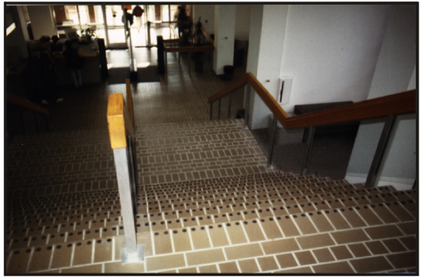
Figure 2
Appearance of the modified stairs
in the D. H. Hill Library (from above).
Photo by author.
In human-factors terms, the dots also had a secondary effect – beyond the perceptual one already described. Such dots intentionally have a distinct surface texture, which assists in avoiding falls while bathing. That is to say, the surface of a dot was rougher than the surface of a tile.
Thus, when walking on the stairs, one might encounter either of two different kinds of traction. If your foot landed mostly on a tile, you would feel your foot move smoothly off the tread when you took your next step. In contrast, if you placed your foot directly on a dot, your foot would momentarily tend to stick. (Later, a colleague told me that the local building code did not approve stairs with contrasting surface qualities. I did not confirm this information, but it certainly would make sense.)
The handgrips were unchanged from the first set of steps.
Not too surprisingly, accidents continued.
A solution for the problem
When the dots failed to correct the problem, the several parties involved (including, I presume from newspaper stories, the university, the architect and the contractors) discussed what should be done and who should pay.
Eventually, the entire stairway area was walled off. Library visitors were all directed to the elevators. The old (new?) stairs were removed and a completely redesigned stairway was built. The process took 6-9 months, before access to the stairs was again permitted.
The rebuilt stairs (see Figures 3 and 4) finally handled the problems created by the first two attempts. The risers were now closed. There were grip-able handrails at a much more comfortable height. The front edge of each tread had a visibly different appearance than the rest of the tread. And the tile/grout surface was no longer present. To the best of my knowledge, accidents decreased to whatever would be the norm for any often-used public stairway.
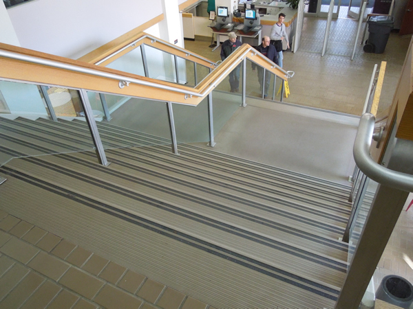
Figure 3
Appearance of the fully rebuilt stairs
in the D. H. Hill Library (from above).
Photo by author.
![]()
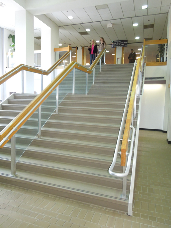
Figure 4
Appearance of the fully rebuilt stairs
in the D. H. Hill Library (from below).
Photo by author.
![]()
Stairway issues redux
As the university continued to expand, an additional campus was developed. In due time, a new library (named for James B. Hunt, a multi-term Governor of North Carolina) was constructed for those programs that had relocated to this "Centennial" campus. This state-of-the-art library facility opened in early 2013. I took an opportunity to visit in March.
Although the overall facility is truly spectacular, including a robotic book mover that replaced most of the traditional stacks, two perceptual issues were immediately evident. And, once again, stairways were one of these concerns. (The other is more functional than safety-based. Several reading rooms feature large windows, lots of metal and other reflective surfaces. The resulting glare will likely result in decreased usage of affected areas during some periods of many days. During my own tour, for example, I noticed that the only patrons in one large room were all tucked into small clusters of chairs that were protected by shadows; areas in direct sunlight and glare were notably empty.)
The stairways of the new library, although quite colorful were – unfortunately – much too reminiscent of the earlier stairways discussed above. Figure 5 shows a view from above one of the new stairways. Figure 6 provides a view from the bottom of another stairway in the same library.
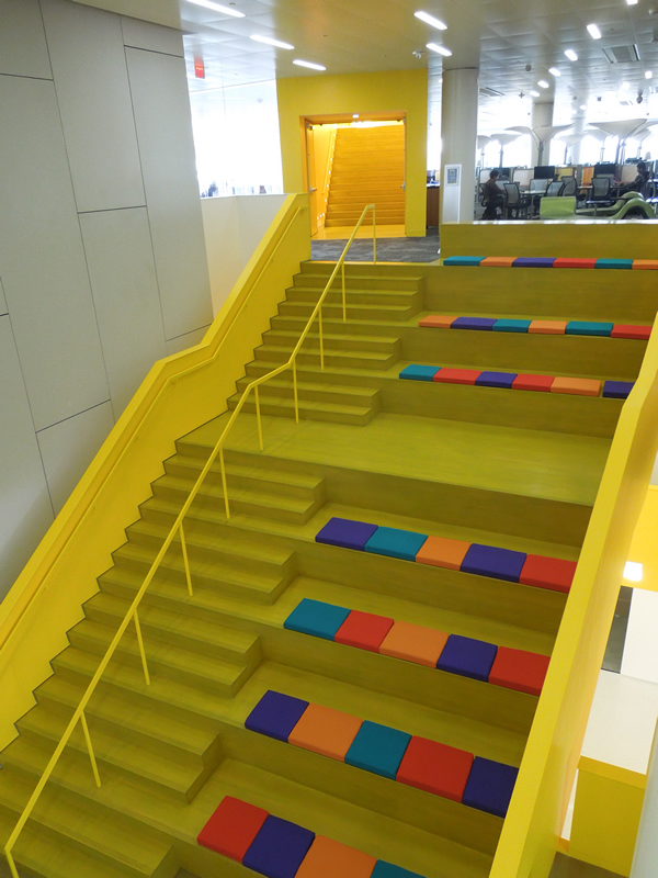
Figure 5
Appearance of a stairway and sitting area
in the J. B. Hunt Library (from above).
Photo by author.
![]()
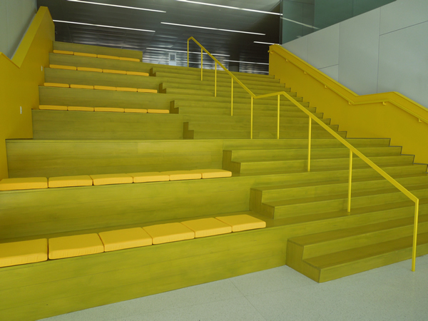
Figure 6
Appearance of a second stairway and sitting area
in the J. B. Hunt Library (from below).
Photo by author.
![]()
I will leave it to the reader to decide whether a study of perception and of human factors would support the architectural choices shown. Note in particular the similar, even if not identical, yellow on the stairs themselves, as well as the areas beside them. Note also the lack of any railing within grabbing distance, if you happen to misstep while descending. (Now add the consequences of a momentary distraction upon seeing a friend seated on a cushion beside the stairs. Consider how the possibility of a bad outcome might increase if one were descending the stairs of Figure 5 while carrying a load of study materials and/or a laptop.)
Since my visit, I have learned that at least some library staff members themselves call these new stairs the Stairs of Death. I will update this article, if the university decides to re-paint or redesign this aspect of the new facility. Meanwhile, I will hope my expectations are perhaps too pessimistic.
Addenda:
In late summer of 2015, the university did decide to repaint the stairways in the Hunt Library. A brief article about the paint freshening appeared in the local newspaper. And what is the stairways' "new" color? You guessed it – Yellow!
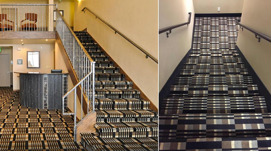
I suppose that things could be worse. Consider the stairs shown below. These are described as being in the Alpine Inn in Frisco, CO. I just hope that room service has an alternative route for delivering food and drink to guests. And watch out for that bottom step; it's a dilly!
A Supplementary Article is devoted to readers’ submissions of unusually poor or somehow “incredible” stairways. For the supplement, the striking aspect(s) may include “visual” characteristics or may simply involve unusual, impractical or unsafe designs. Selected submissions may be currently accessed at Stairways of Death Supplement. To have your picture(s) considered for publication, send a request through the Contact or Comment page here. Include the source to which each picture should be credited (your name, a pseudonym or simply “anonymous” are all OK). A brief description of where the stairs are located is nice, but not required. Your submission must be accompanied by your actual name and email address (not for publication, unless you wish it), as well as a statement that you own the right to exhibit each picture (e.g., you took it) and that you agree to the rules of the Practical Perception site (including in particular the sections on TERMS OF USE and on COPYRIGHT).